
Each season home furnishings designers look to the fashion runway and European home shows such as Maison & Objet for color and style direction. Both sources cite the color purple as firmly on-trend, so it’s no surprise it’s making its way into furniture stores. From deep purples to hazy shades of lavender, there’s no shortage of options for using this captivating hue in your home.
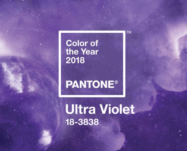
Global color forecasting agency Pantone proclaimed “Ultra Violet” as its 2018 Color of the Year. Confirming the future of blue-based purple hues in interior design, the color was chosen for its complex and contemplative personality.
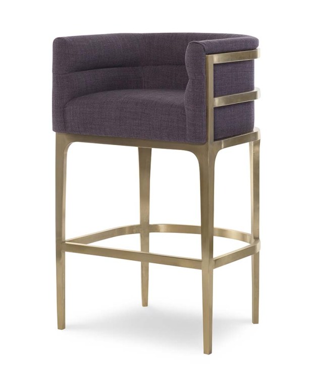
The Manhattan Barstool from Fine Furniture Design features a streamlined shape upholstered in a soft shade of plum and accented with a frame in an on-trend gold finish.
Enigmatic purples such as this are often associated with counterculture, unconventionality, and artistic brilliance—popularized by western pop culture and musical icons such as Prince, David Bowie, and Jimi Hendrix. An expressive hue, Ultra Violet serves as a personal expression of individuality. According to Pantone, this year’s color is nuanced and full of emotion, symbolizing experimentation and non-conformity. It may be just the color to spur individuals to make their unique mark on the world by pushing boundaries and exploring creative outlets.
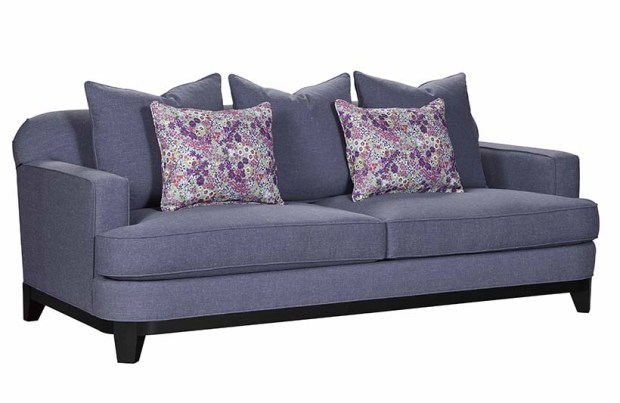
At Broyhill, purple has gone mainstream with the debut of its Augusta sofa. Featuring coordinating floral accent pillows, this two-cushion sofa with loose back pillows is upholstered in a subtle shade that can be emphasized or downplayed.
“We are living in a time that requires inventiveness and imagination,” says Leatrice Eiseman, executive director of the Pantone Color Institute. “It is this kind of creative inspiration that is indigenous to PANTONE 18-3838 Ultra Violet, a blue-based purple that takes our awareness and potential to a higher level. From exploring new technologies and the greater galaxy, to artistic expression and spiritual reflection, intuitive Ultra Violet lights the way to what is yet to come.”
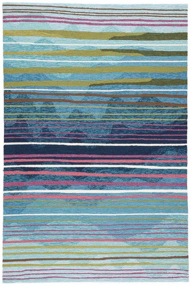
If you’re not ready to embrace purple in a big way, try incorporating it into your design plan by choosing a rug, artwork or accessories in the shade. Rug shown from Jaipur Living.
Historically, there has been a mystical or spiritual quality attached to shades of purple. The color is often associated with mindfulness practices, which offer a higher ground to those seeking refuge from today’s over-stimulated world. Lighting with purple undertones is used in meditation spaces and gathering places to energizes those that gather and inspire connection.
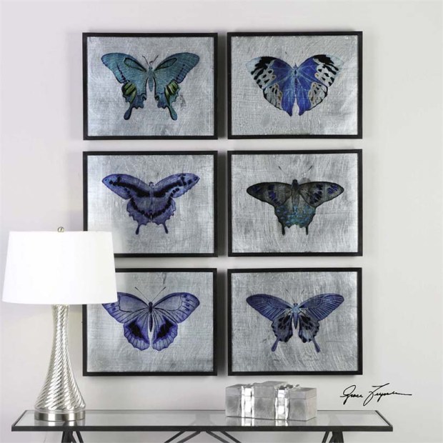
Artwork featuring purple hues gives you the opportunity to try on the shade with a short commitment. Artwork shown from Uttermost.
The traditional color of royalty, purple also provides the perfect complement to the continued dominance of gold, bronze and warm metallics in home décor. Deep purples ranging from wine to plum provide a perfect accent to today’s popular charcoal and dove gray sofas and sectionals. Softer gray-based purples are soothing shades for bedrooms and offer a calming effect. Purple is also trending in dining rooms as the ideal complement to yellow and gold.
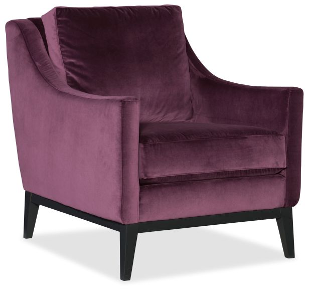
Rich in both color and texture, Sam Moore’s Cheekie Exposed Wood chair is covered with a velvety fabric in a berry hue that pairs equally well with warm and cool neutrals.
